Las Vegas Enforcers
Onlyness Statement
The Las Vegas Enforcers are the only ECHL team in the Las Vegas area that provide philanthropic acts to active working adults and suburban families through fair pricing, community focused events during games, and making meaningful contributions to their supporters.
Vision Board
This vision board showcases all previous elements in a professional and connected way to the Las Vegas Enforcers brand. This board includes the brand's onlyness statement, voice & tone, and look & feel.
Logo Concepts
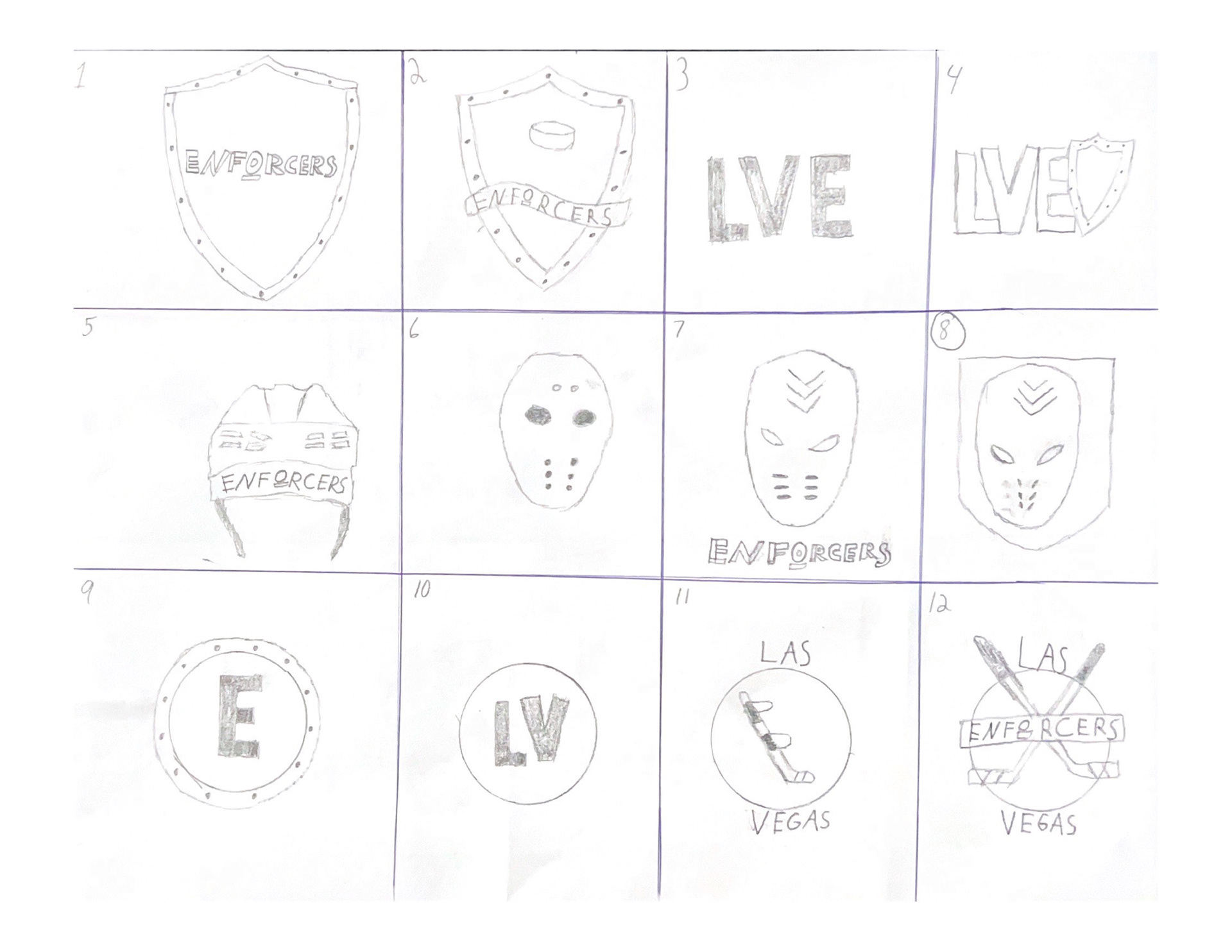

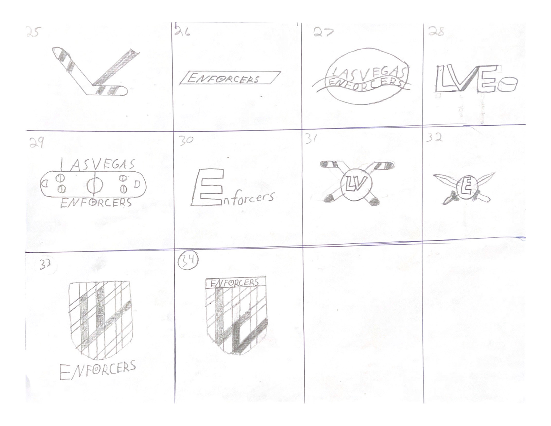
The Enforcers need a unique and recognizable brand mark to increase audience appeal. The first step in this logo process was finding the best ideas that correlated with the brand identity and then sketching multiple versions of each idea. While these logo concepts were nowhere near the final design, this process helped to narrow down the best possible ideas and expand upon those sketches.


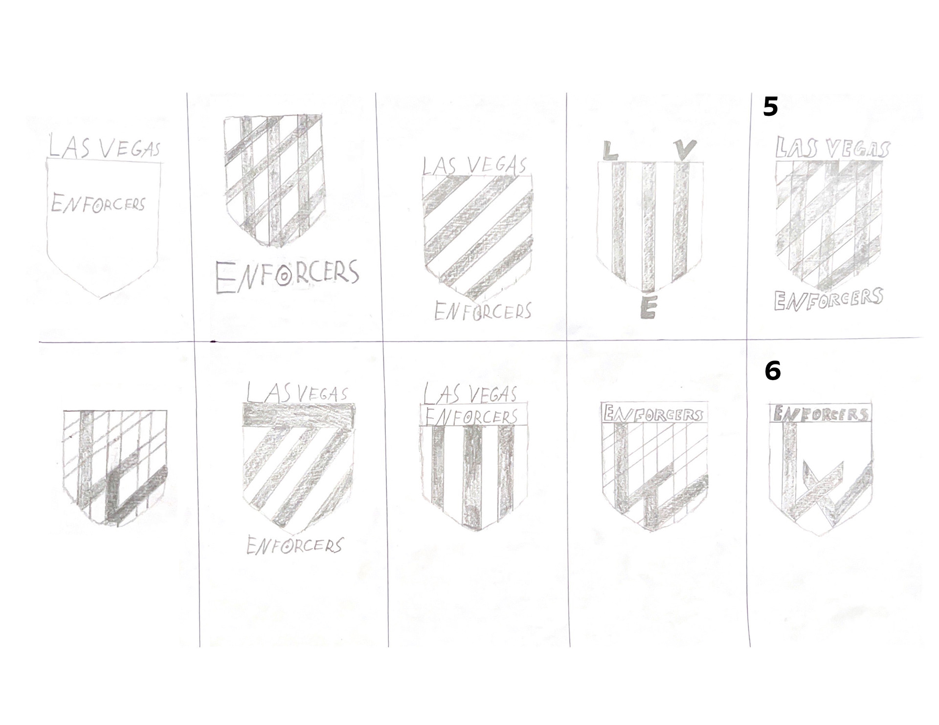
The first sketch refinement involved more detailed sketches of the top six design ideas for the logo. These refined sketches helped to show which design idea was the strongest in terms of matching the brand message, theme, values, etc. While some designs in this refinement stage did not fit the brand, it was important to refine these sketches anyway as changes can help to make the logo match the brand more closely. Once the refined sketches were reviewed, it was time to create rough vector logo of the three best ideas.
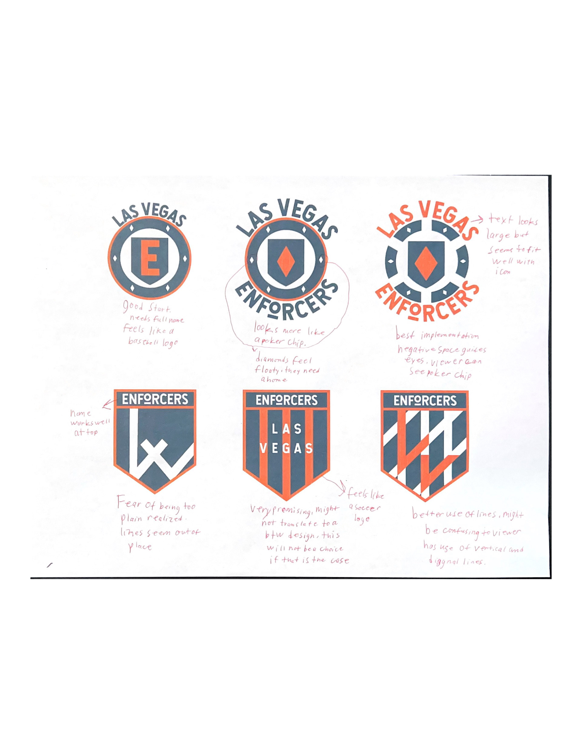
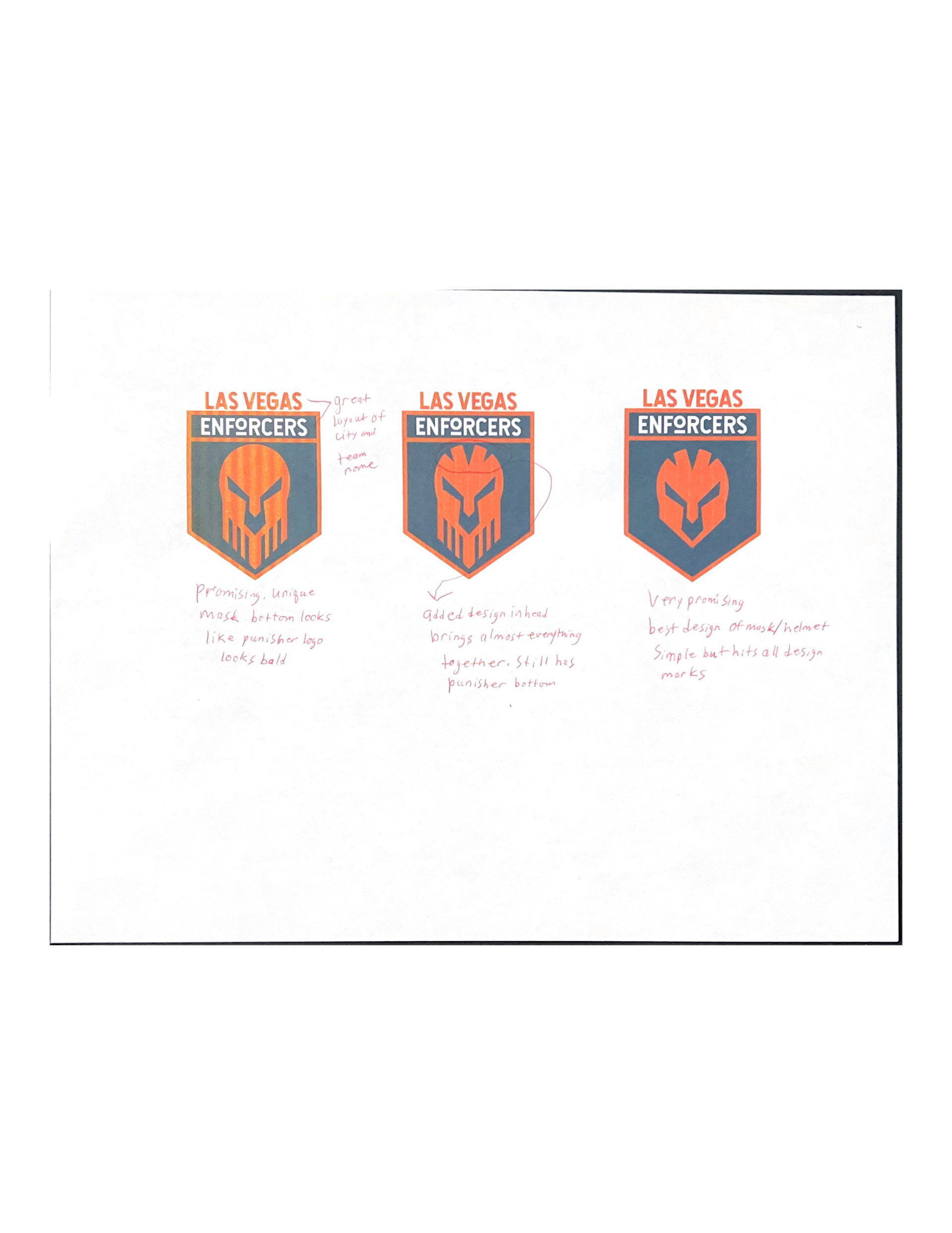
The top three design ideas were then taken into a digital workspace to further refine such as adding color and creating rough vectors. One main problem at this stage was trying to showcase the sketch onto a digital platform. No matter how well the sketch is done, it can be hard to convey the same message once digital elements are created. After this was completed, the two best logos were chosen and fully detailed in both black and white and color.
Final Logo
The final logo was both simple while also being unique in its category. Besides these elements, the logo also stays in line with the brand identity and acts as an extension of the brand. The logo should never feel separate or different from the brand itself. These two must be tied together, and the created Enforcers logo achieves this by conveying all necessary elements of the Enforcer brand.
Media Asset Sketches
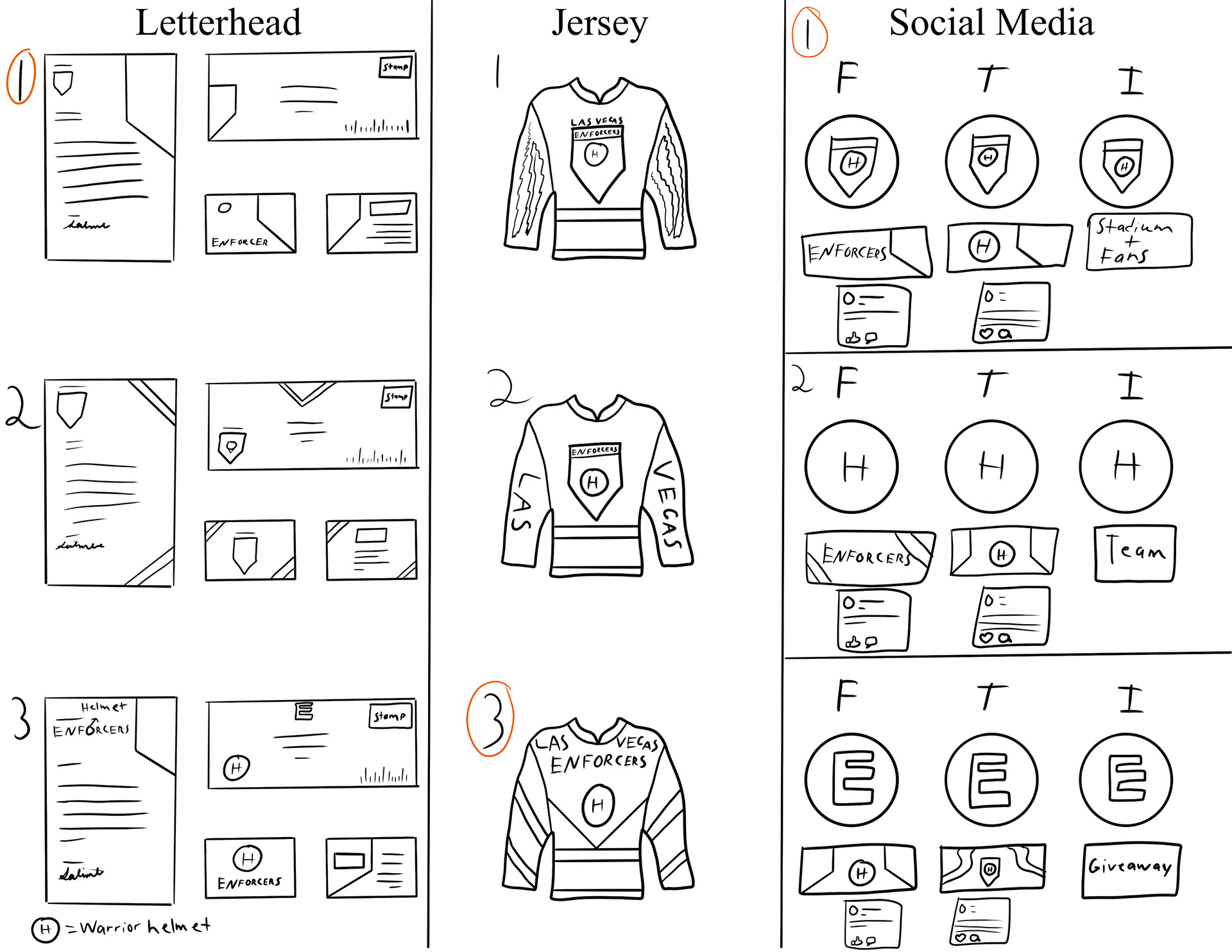
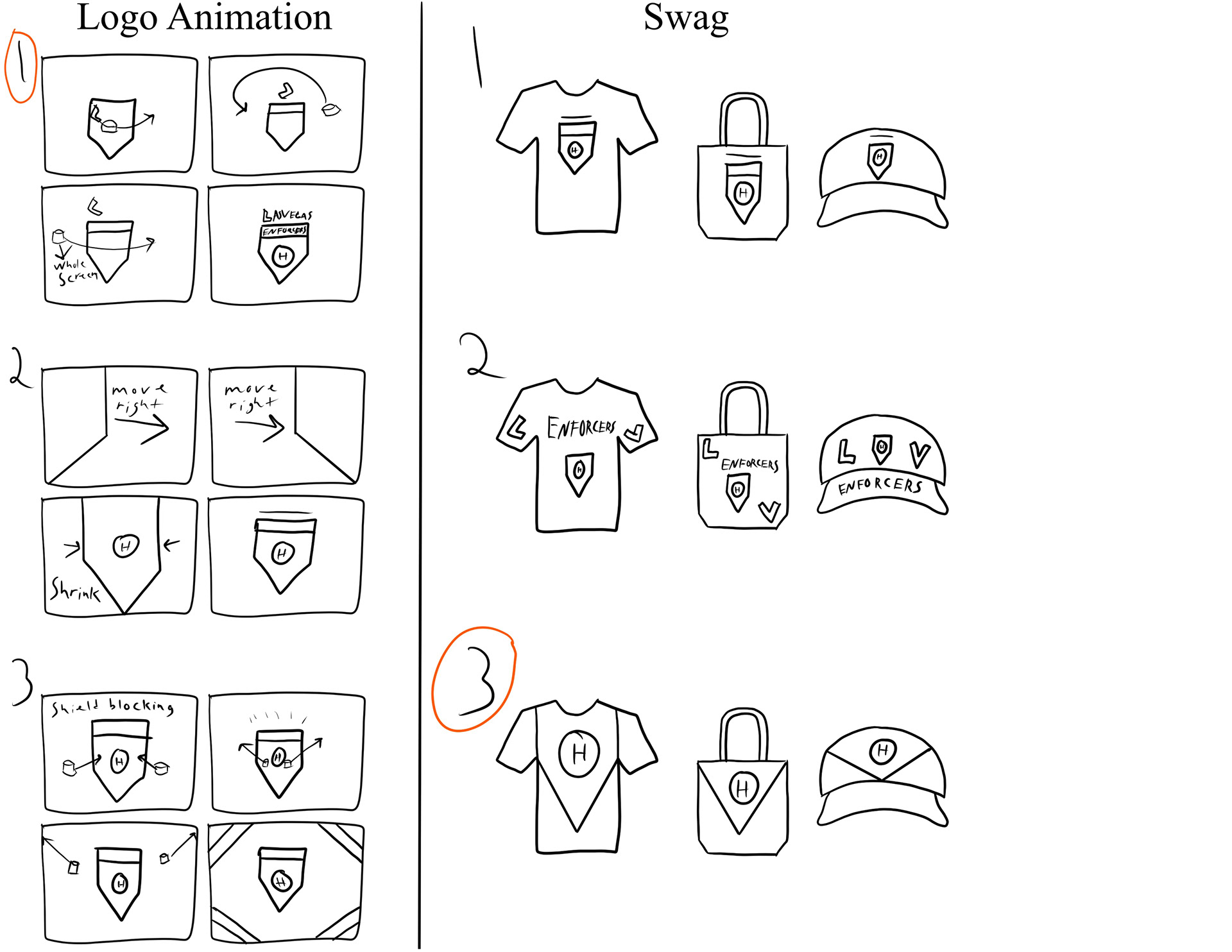
The next part of the project, and the most design heavy, was the creation of the appropriate media assets for the brand. This started by choosing the six media assets that would be designed throughout the month. Once these assets were chosen, sketches were created to showcase the rough ideas on how these assets would be created and how they would connect to the brand. The best sketches for each asset were then used as a reference when making the actual media assets for the work each week.
Letterhead Design
The letterhead design needed to be simple yet effective to the audience that would receive it. The final letterhead design used simple graphic elements and the chosen brand font to create a professional yet brand appropriate letterhead design.
Jersey Design
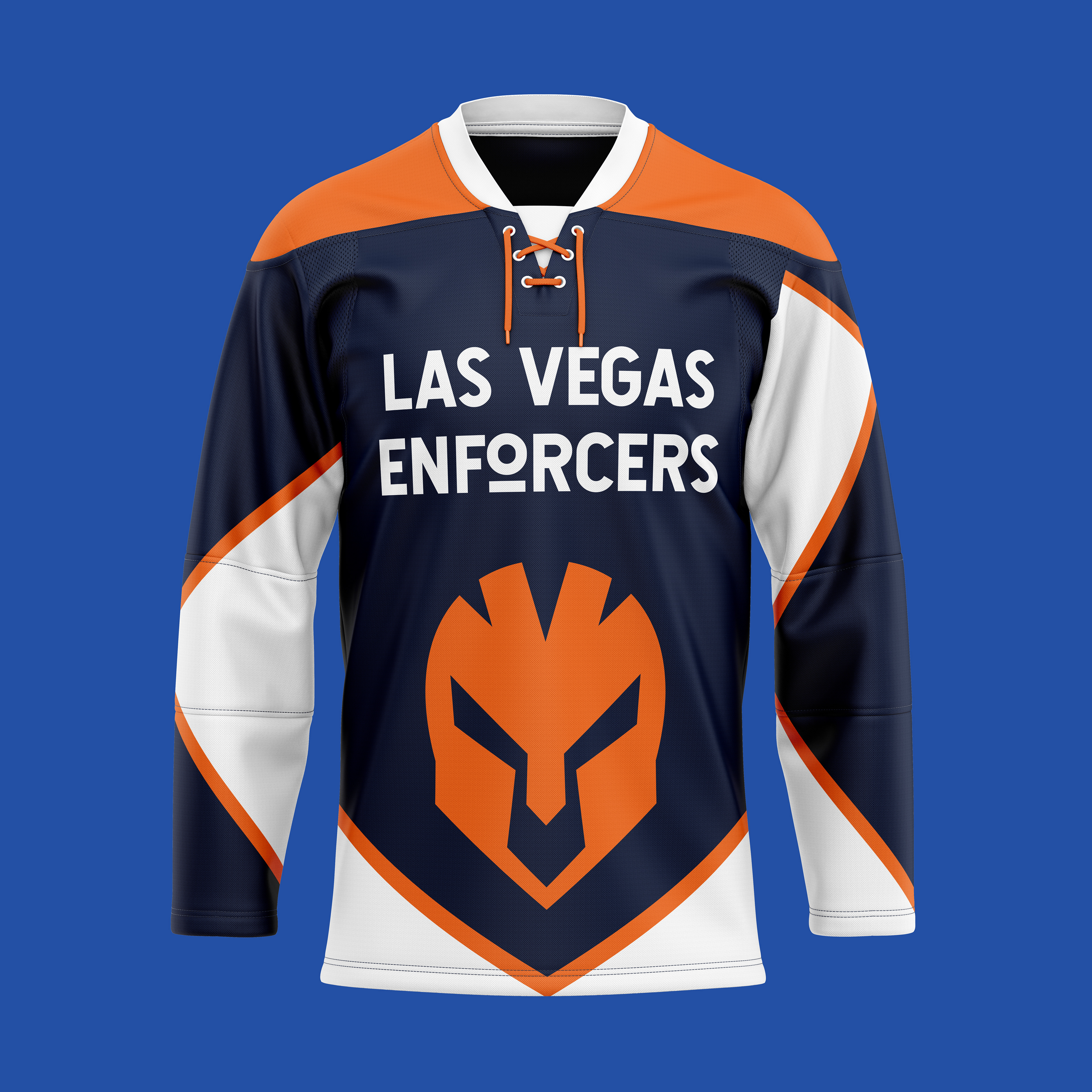
The jersey design was different than other merchandise as a jersey is the main source of advertisement for the brand. The team wears it, the jersey is in almost every ad, and fans can wear them to games and around town. This was noted while designing as the jersey was created to standout and feel like a refreshing design in the world of hockey merchandise.
This jersey was made to be recognizable immediately while also displaying the full location and name of the team. The shield was resized to take up the entire middle of the jersey and represent the fact that anyone who wears the jersey is part of the Enforcers brand. The jersey sleeves were designed with waving lines to represent the energy and flow of hockey and skating.
Social Media Assets
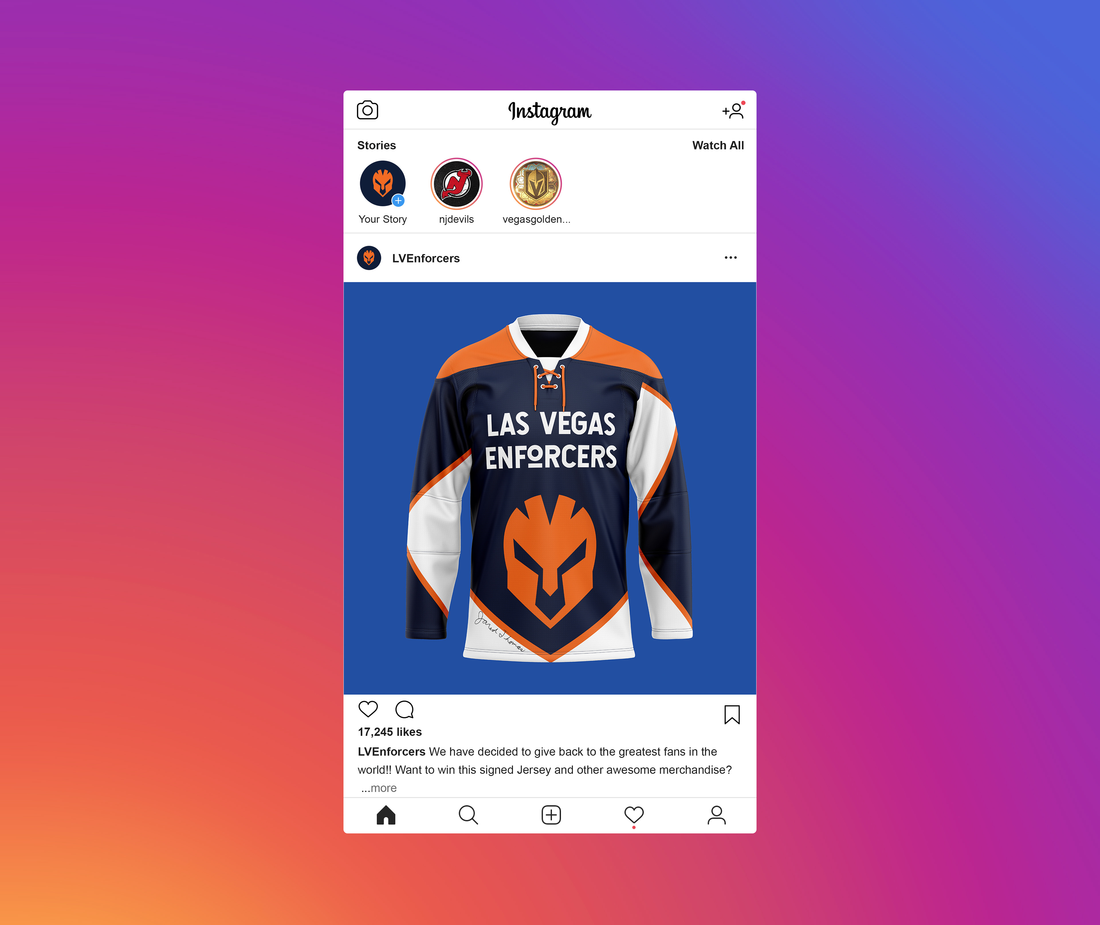
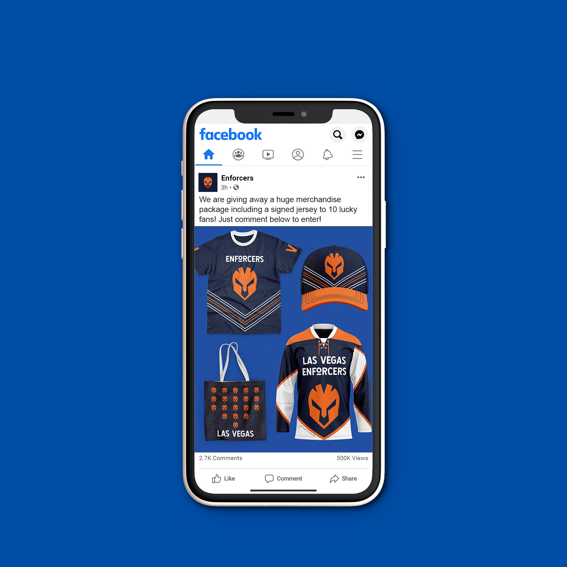
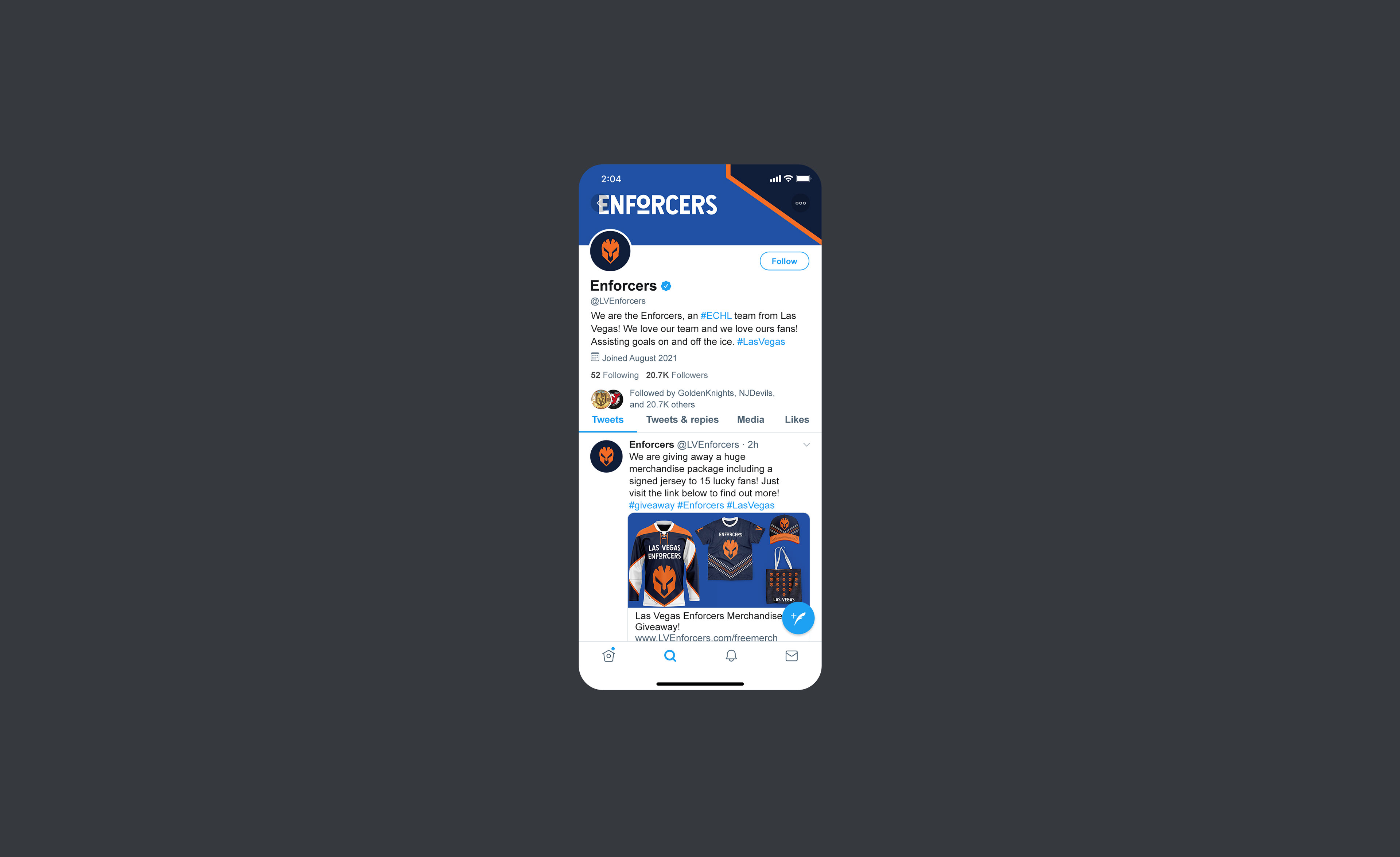
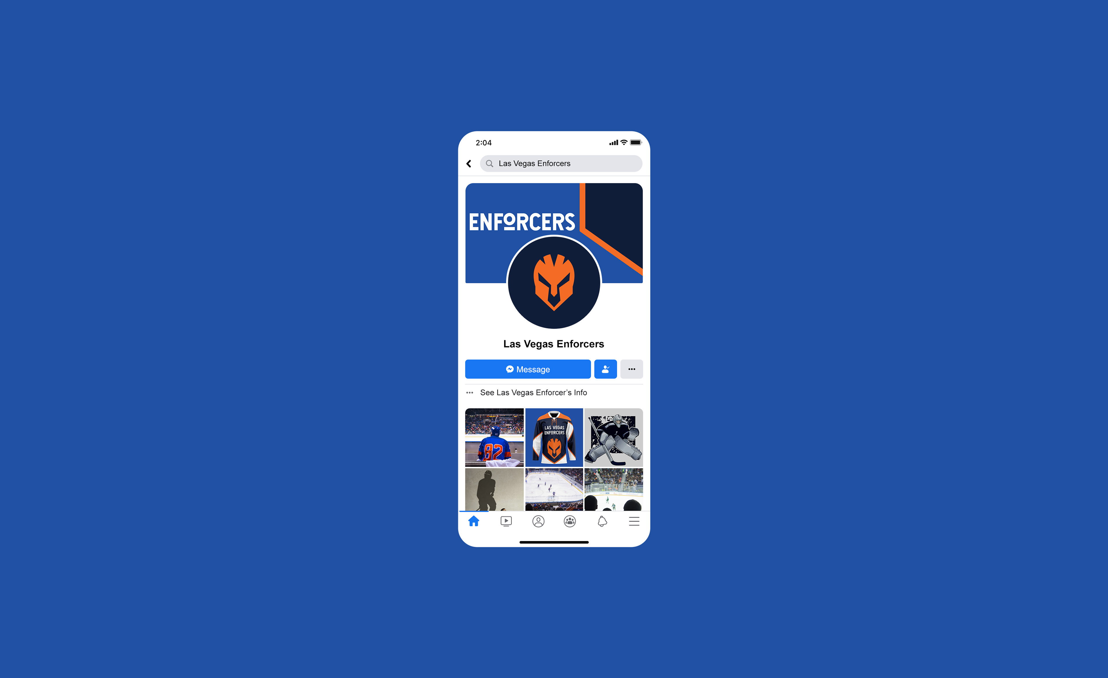
The social media assets needed to be relevant to the brand, engaging to the target audience, and informative. As consistency is also a major factor in design, it was important to keep a consistent feel throughout all social media platforms.
Some designs were reused for each platform as this made it easier to recognize whose social media page someone was on. The designs also incorporated a giveaway as this is in line with the brand’s message of not only being entertaining but also the fact that they want to give back and support the local communities and fans as much as possible. These social media design showcase the brand being able to reach their fans through multiple ways, not just around the area or in the stadium. They also help solve the larger problem of the brand trying to show both the entertainment side and the philanthropic side as this was the main problem that needed to be solved. Creating a consistent online identity in the form of social media assets also helps to establish the brand and make it more recognizable while also ensuring future engagement of the brand online.
Swag Assets
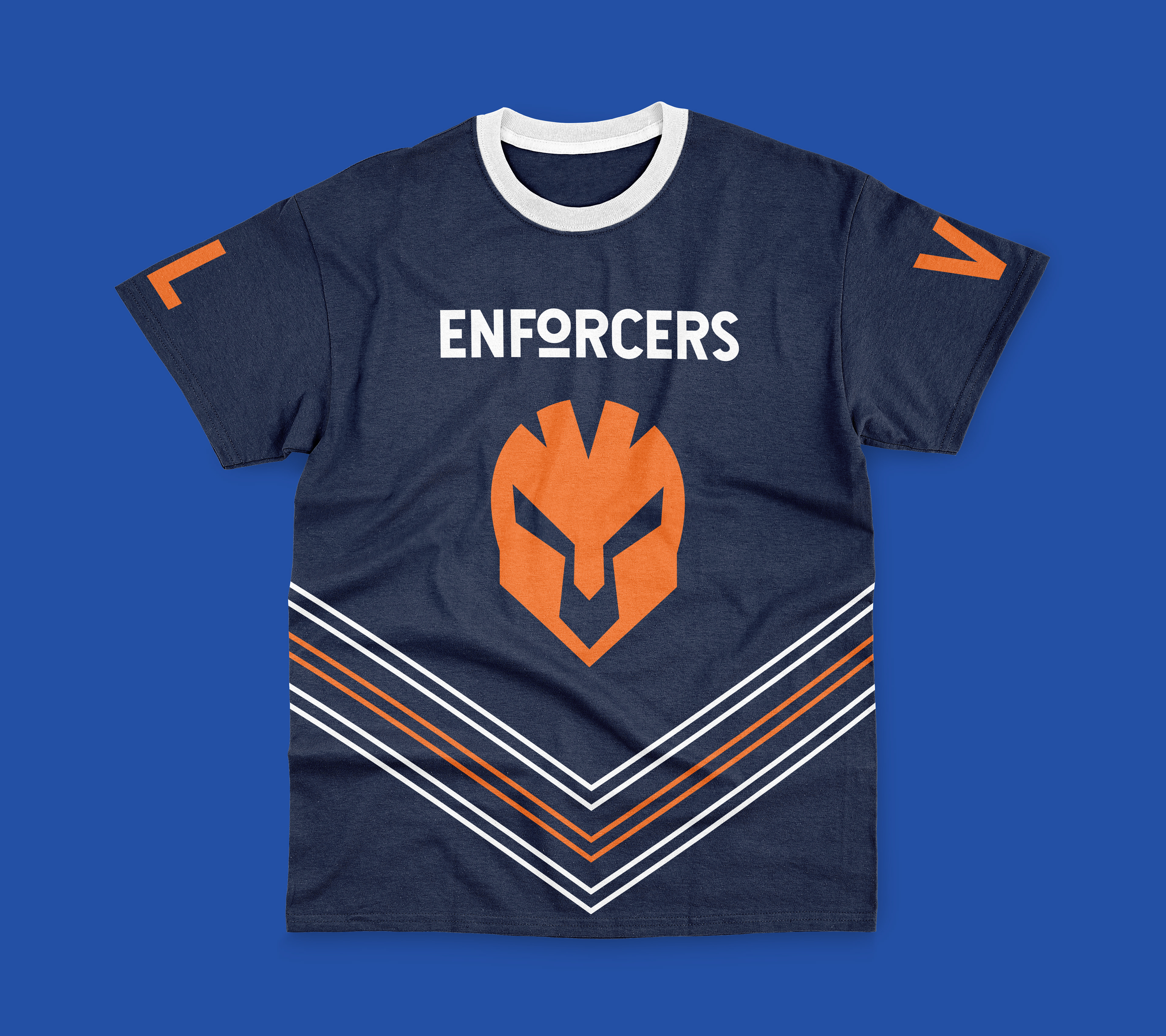
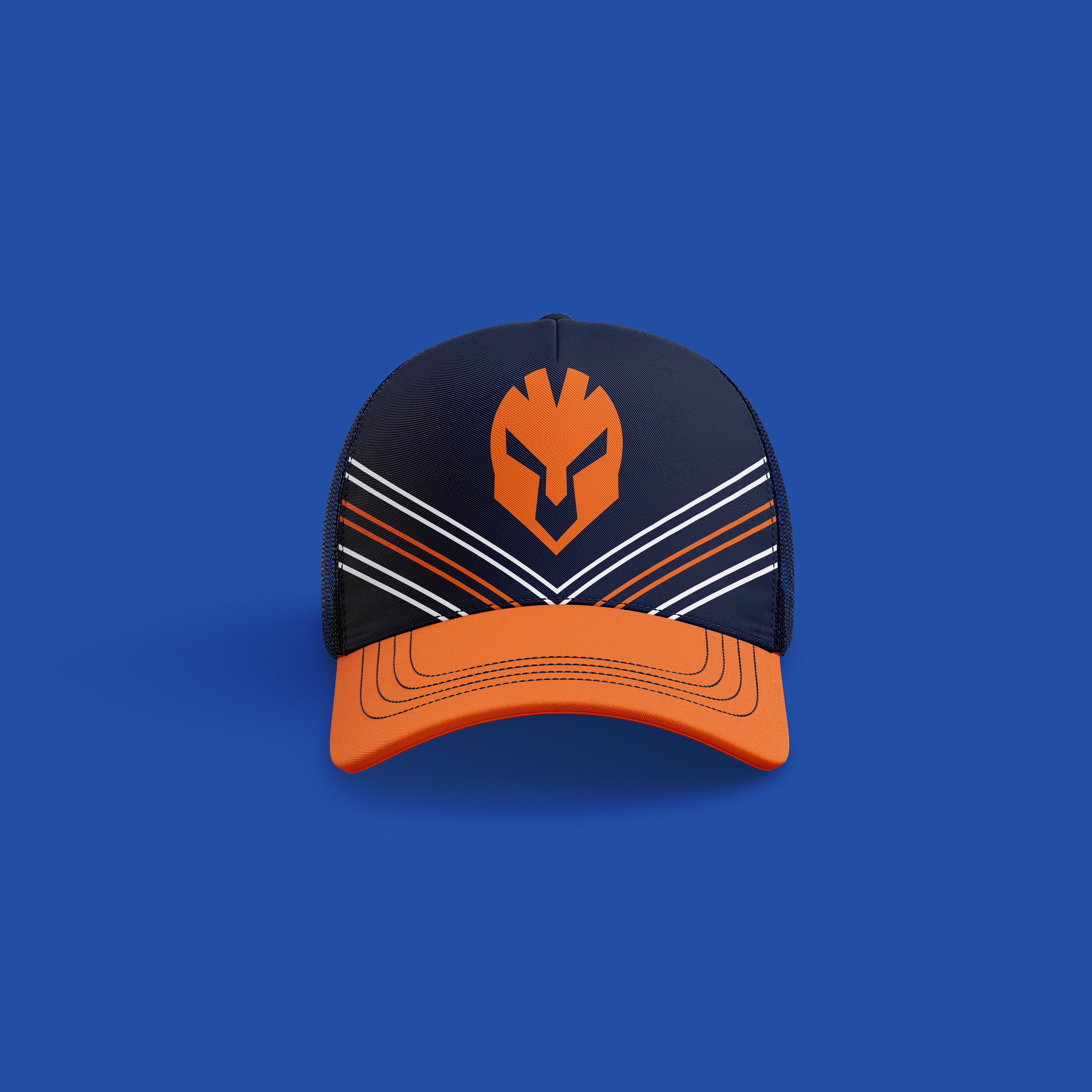
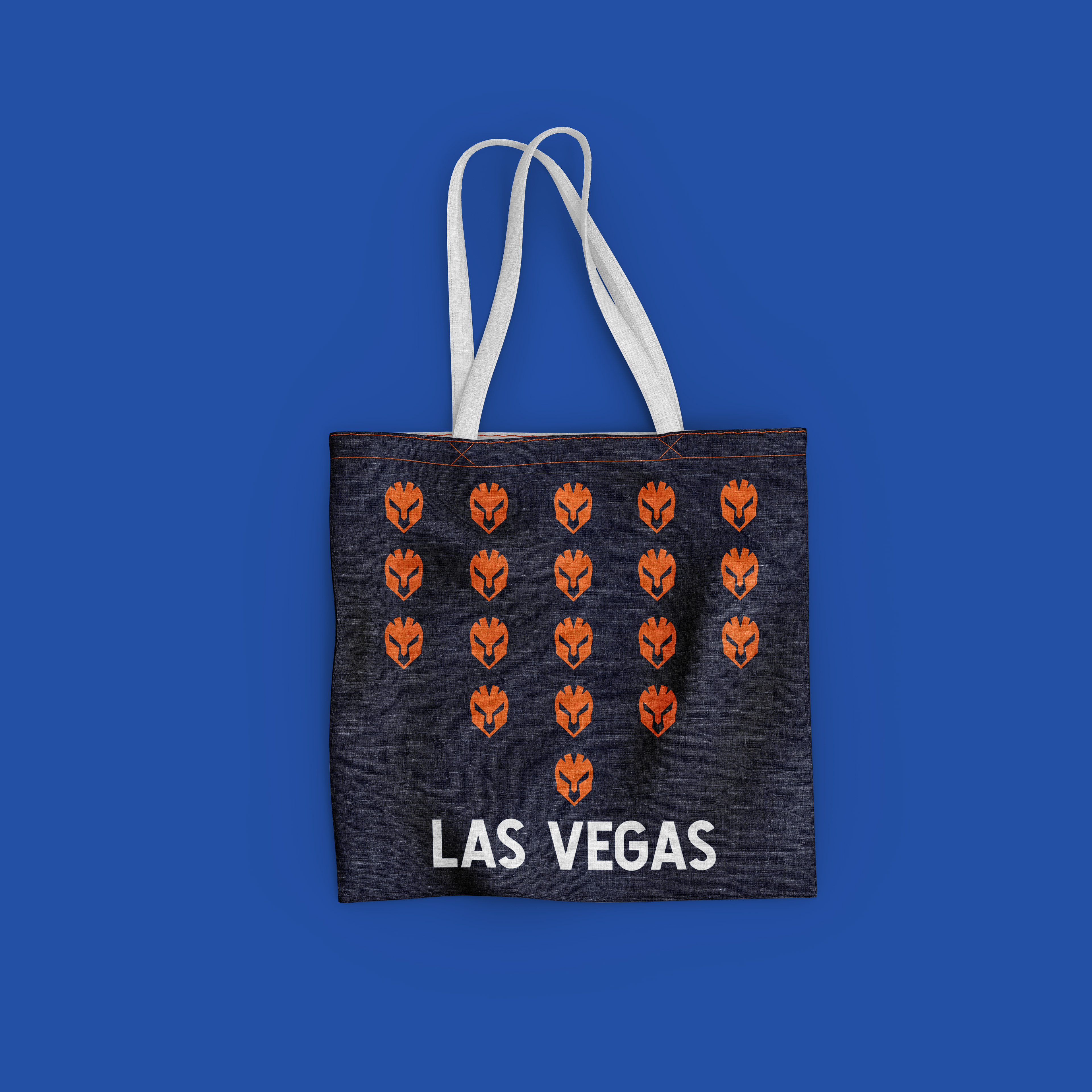
The swag assets aim to solve the problem of making the brand and the fans more connected. This was solved by creating multiple pieces of merchandise such as a t-shirt, a hat, and even a canvas bag.
The t-shirt was designed as a simplified version of the jersey. It incorporated a new striped chevron graphic that took the solid chevron of the jersey and made it much softer. The hat was also designed using this new chevron graphic. Different version of the t-shirt and hat were designed as well since more options can equal more happy fans. The canvas bag took the helmet of the logo and turned it into a shield pattern. This new pattern made the bag standout while still being relevant and recognizable to the brand. These designs were created for the simple fact that fans want to engage with their favorite teams. Creating swag assets gives the fans more opportunities to show their team spirit while also supporting the brand.
Logo Animation
Looping Animation
Vision Board
This brand playbook is the summation of a full year of design research, development, and implementation. This brand playbook started as an idea and grew into a full on showcase of a fictitious brand that needed everything from beginning research to the final showcase through a brand playbook. Deep research about the brand was done that included things such as the features, benefits, and even target audience. Design assets were created that included a logo animation, merchandise, and even a jersey design for the players. To read about my entire MFA journey, visit my Adobe Spark Mastery Journal page. To learn more about my thesis project, visit my Thesis Page.
